Rice Packaging Design
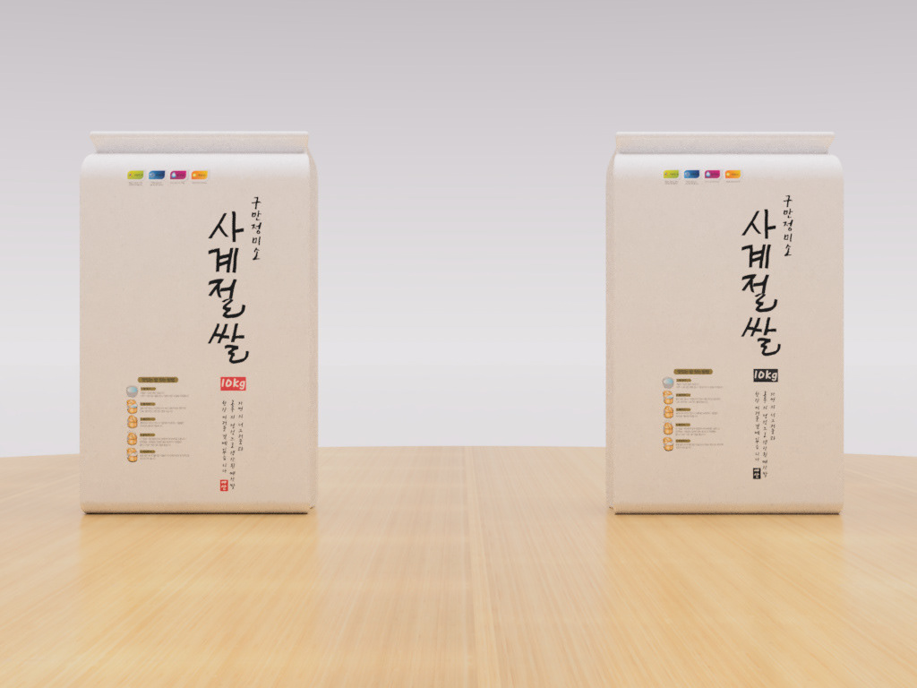
Created rice packaging designs for South Korean rice packaging manufacturing company called Sa-Gye-Jeol-Ssal, which translated into The Four Seasons Rice in English. Designed two layout designs in red and black colors, using their brand guidelines. Rebuilt their brand name (the largest Korean word written vertically).
Meant the whole layouts to resemble Korean traditional art in a simple and clean style.
Meant the whole layouts to resemble Korean traditional art in a simple and clean style.
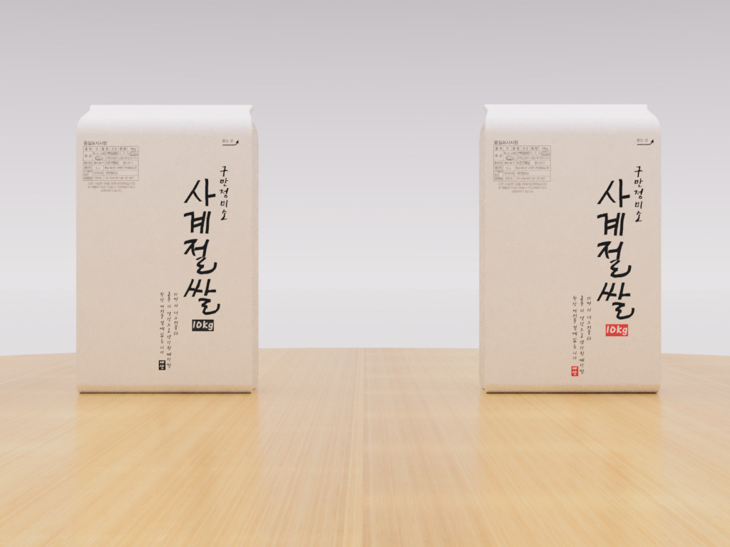
Rice Packaging Design In Red And Black Version // Front View
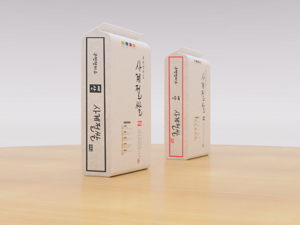
Designed the semi-transparent sides of each packaging design. Semi-transparent sides of each packaging design help us to check the inside contents easier.

Designed the semi-transparent sides of each packaging design. Semi-transparent sides of each packaging design help us to check the inside contents easier.
Rice Packaging Design In Red And Black Version // Back View